Painting project
DESCRIBE
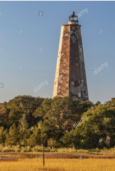
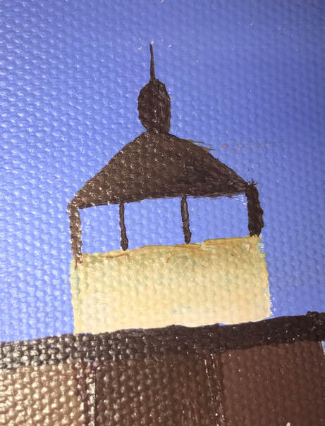
My piece is an acrylic painting depiction of the Old baldy Light house on Bald head Island. My piece is from the point of view of an observer of the lighthouse on the nearby bridge. In this piece I used my knowledge of the mixing of different primary and complementary colors to create different colors, and tones that i used throughout my piece.
ANALYZE
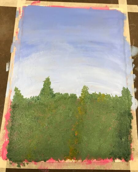
Throughout my piece you can see various shades and tones of different colors. In order to create a shade, I would mix some black paint in, and in order to create a tint, I mixed in some white paint. In order to create slightly different colors I would play with the mixing of complementary colors until I had created just the right color I was looking for.
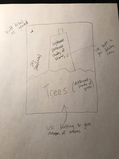
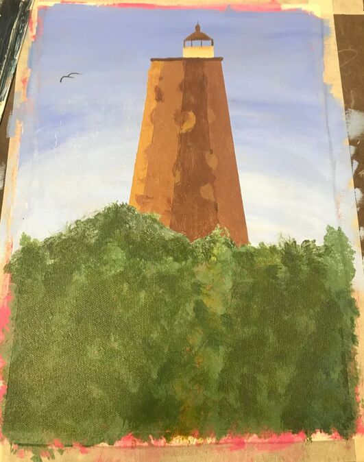
In my piece I put the emphasis on the lighthouse. The light house is the focal point of the piece, so I placed the lighthouse near the top, center of the canvas in order for intuitive viewing. Everything other than the lighthouse is just background, supporting contextualization for it. I really liked the composition of my piece.
INTERPRET
The instructions that Ms. Sudkamp gave me was to paint a place that is important to me. I instantly thought of Bald Head Island, and nearly after that I knew that I had to paint the staple of the island, Old baldy. I took inspiration from the great Thomas Cole, and his amazingly detailed landscape masterpieces. Looking at some of his pieces helped me develop the point of view that I was looking to portray in my piece.
JUDGE
Because I was sick for such a long period of time, I only has 2 and a half days to complete my piece. I feel that with the short period of time that I was allotted, I did a very good job of producing a piece that I am proud of. I think the best part of my piece is the value on the point of the lighthouse, I think it looks very realistic.
From this assignment I learned to be careful of what paint you use to paint your piece with. I chose to use some blue paint that had been going bad, and because of this there is some cracking in the paint on the top left portion of the sky in my piece. This is an important lesson and will be taken into account in my future pieces.
My piece is an acrylic painting depiction of the Old baldy Light house on Bald head Island. My piece is from the point of view of an observer of the lighthouse on the nearby bridge. In this piece I used my knowledge of the mixing of different primary and complementary colors to create different colors, and tones that i used throughout my piece.
ANALYZE
Throughout my piece you can see various shades and tones of different colors. In order to create a shade, I would mix some black paint in, and in order to create a tint, I mixed in some white paint. In order to create slightly different colors I would play with the mixing of complementary colors until I had created just the right color I was looking for.
In my piece I put the emphasis on the lighthouse. The light house is the focal point of the piece, so I placed the lighthouse near the top, center of the canvas in order for intuitive viewing. Everything other than the lighthouse is just background, supporting contextualization for it. I really liked the composition of my piece.
INTERPRET
The instructions that Ms. Sudkamp gave me was to paint a place that is important to me. I instantly thought of Bald Head Island, and nearly after that I knew that I had to paint the staple of the island, Old baldy. I took inspiration from the great Thomas Cole, and his amazingly detailed landscape masterpieces. Looking at some of his pieces helped me develop the point of view that I was looking to portray in my piece.
JUDGE
Because I was sick for such a long period of time, I only has 2 and a half days to complete my piece. I feel that with the short period of time that I was allotted, I did a very good job of producing a piece that I am proud of. I think the best part of my piece is the value on the point of the lighthouse, I think it looks very realistic.
From this assignment I learned to be careful of what paint you use to paint your piece with. I chose to use some blue paint that had been going bad, and because of this there is some cracking in the paint on the top left portion of the sky in my piece. This is an important lesson and will be taken into account in my future pieces.
Reference Image
Sketch, Brainstorming, & Plans
Helpful Warm-up

In-Progress Photo
Final Photo
Detail Shot
Painting warm-ups
During this unit, I missed 8 days of school due to illness, and DECA. Because of this I have only completed some of the drawing warm-ups. Below are the ones that I have completed.
Questions
1) From theses activities I learned how to manipulate colors in order to create the specific color I was looking for, and how to seamlessly transition between different colors and tones in a piece.
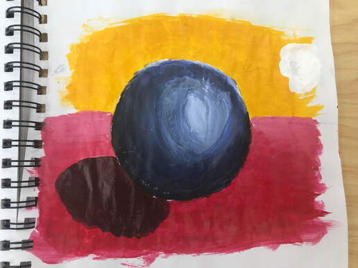
2) The most helpful warm-up for the painting I planned would be the acrylic painting of a sphere. This was very helpful because it taught me how to create different shades of colors, and how to create the illusion of depth in a 2D painting.
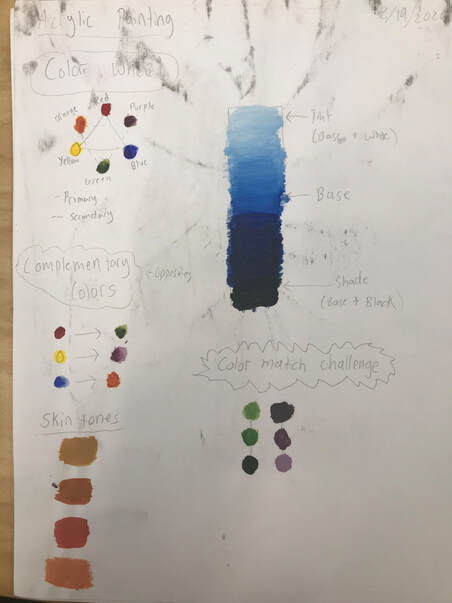
3) The warm-up that I learned the most from would be the color wheel, because during the creation of my piece I constantly referred back to this to figure out how to create the shades and tints of different colors I was using in my piece.
4) Some ways to make brown include...
- Mix all of the primary colors together
- (Red, yellow, and blue).
- Mix 2 of the complementary colors together.
- (blue and orange)
- (red and green)
- (yellow and purple)
5) Some ways to tone down a color include...
- Adding a neutral tint.
- Mixing it with small doses its complementary color.
Questions
1) From theses activities I learned how to manipulate colors in order to create the specific color I was looking for, and how to seamlessly transition between different colors and tones in a piece.
2) The most helpful warm-up for the painting I planned would be the acrylic painting of a sphere. This was very helpful because it taught me how to create different shades of colors, and how to create the illusion of depth in a 2D painting.
3) The warm-up that I learned the most from would be the color wheel, because during the creation of my piece I constantly referred back to this to figure out how to create the shades and tints of different colors I was using in my piece.
4) Some ways to make brown include...
- Mix all of the primary colors together
- (Red, yellow, and blue).
- Mix 2 of the complementary colors together.
- (blue and orange)
- (red and green)
- (yellow and purple)
5) Some ways to tone down a color include...
- Adding a neutral tint.
- Mixing it with small doses its complementary color.
Acrylic sphere painting
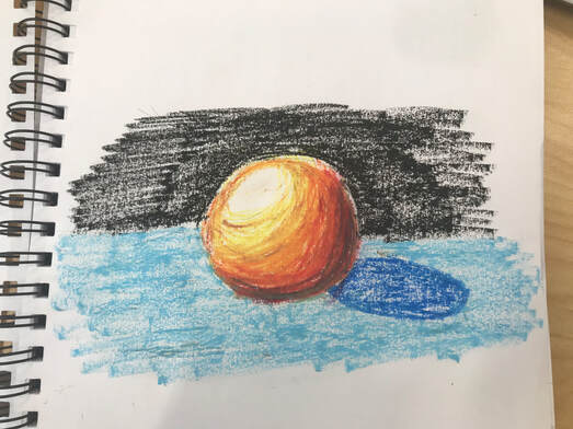
Wax Sphere painting
Color Wheel
INtro to Drawing Project 1
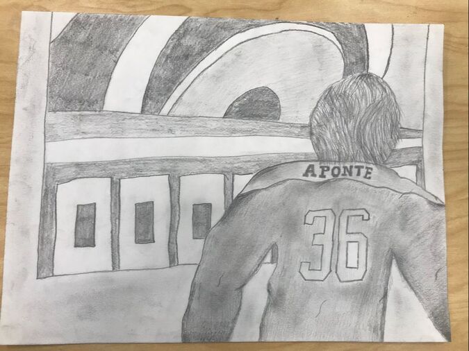
Pencil Drawing- Cougar Hockey
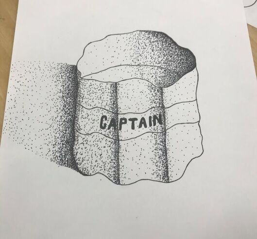
Pen Drawing/ Stippling - Captains Band
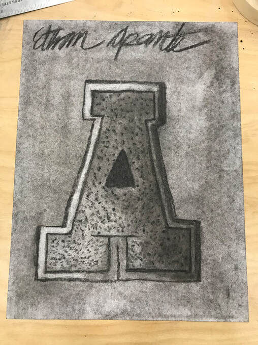
Charcoal Drawing - Varsity Letter
Moat helpful warm up - creating a picture out a random line
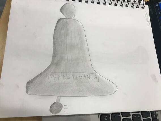
1) Sami drew a random squiggle on my paper, and I was instructed to create a drawing, incorporating the squiggle. For about 5 minutes I just stared at the paper, thinking about what I could do. Eventually I had a breakthrough and thought to draw a bell by some random strike of inspiration. This is why I say this was the most helpful warm up for me because it really got me to think outside of the box, and helped me to think in a creative, artistic way in which I hadn't ever before. Along with this, it was a very helpful exercise for me to practice the creation of value in my pieces.
2) Composition- The placement or arrangement of the visual elements in a piece of artwork.
Value- The element of design that defines the light and darks in an artwork.
3) Pen- With pen, you can create cleaner lines, and the piece pops more due to darker and smoother lines. But, with pen, lines are not erasable, and you have to use more difficult techniques of shading such as cross-hatching, stippling, and random-line.
Charcoal- Blends and softens very easily, which can be both and advantage and a disadvantage. It is an advantage because you can build beautiful and seamless value very easily. But it can also be a disadvantage because it can smear, and "dust off" easily which can ruin your piece.
Pencil- Lines are erasable, does not need time to dry, pencil tip can be sharpened or dulled in order to adjust amount of detail wanted. But, pencil drawings can be easily smudged, and the pencil needs to be constantly sharpened in order to keep line detailing consistent.
Inspired artist
Street artist ROA
ROA was born in Belgium in which he began painting large pictures of animals on the walls of in a small native town called Ghent. ROA works with spray paint, and acrylic paints of mainly a mixture of black, white, and gray scale colors. He grew up in the eighties, and claims his inspiration comes from hip-hop music, which sparked his love for graffiti. At a young age, ROA wanted to be an archaeologist, which spurred his love for animals and rodents. Some of his work is very well-known, but very little is known about ROA himself. He is well-known for his attention to detail, and his love for animals and rodents.
https://www.artsy.net/artist/roa
This work is inspiring to me because it is so extravagant and out-there, and it turn the heads of anybody that comes across any of his pieces. Another reason that ROA inspires me is his anonymity. He does not do his work for money, fame, or any other reason other than to paint. The motive of everything in today's society is for monetary gains or societal validation, and it's wild for me to think that this guy does all of his work anonymously. The great amount of detail that he puts into every piece really intrigues and draws me in because the painting look so realistically deceiving.
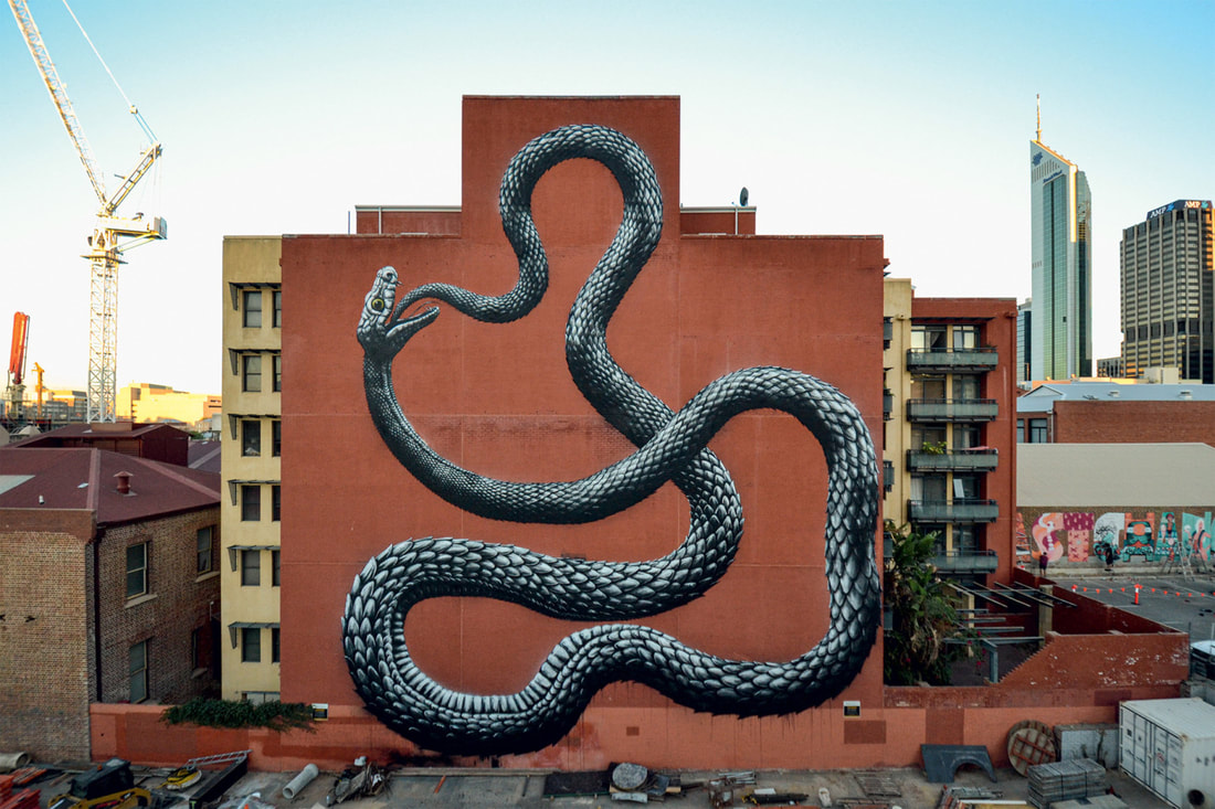
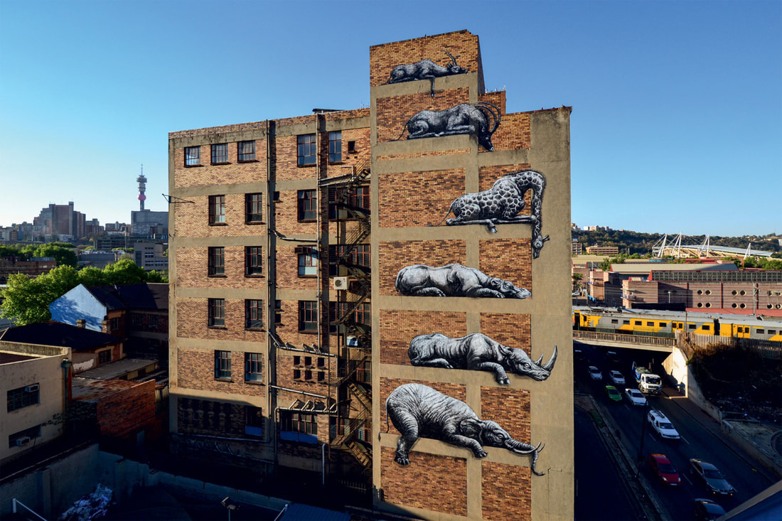
Photo used under Creative Commons from Howard J Duncan
